On this page, I’ll introduce the detail of UX process from Gamerlab App design project.
Bubble Metrix are designed to demonstrate both qualitative and quantitative UX consequences.
1. Empathize
Research Method
Moderated Interview(n=6) To understand how gamers and ergonomic lovers purchase high-performance equipment, I conducted six moderated interviews.
Interview Focus Areas
Usage Context & Behavioral Patterns Interview Focus Areas Equipment Value Perception Purchase Journey & Pain Points
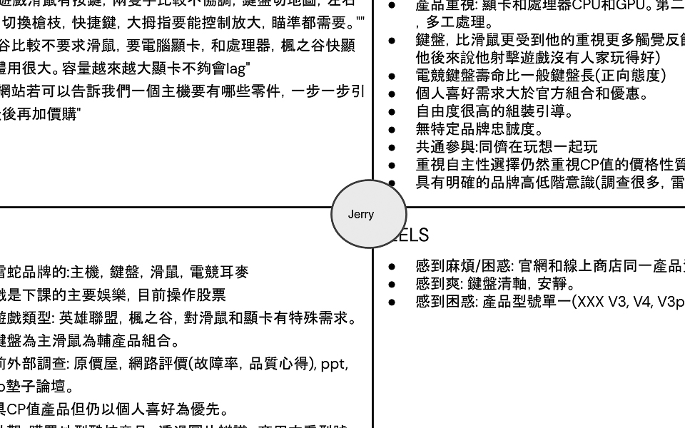
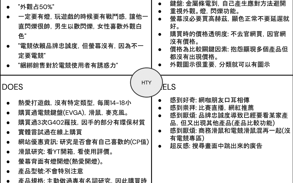
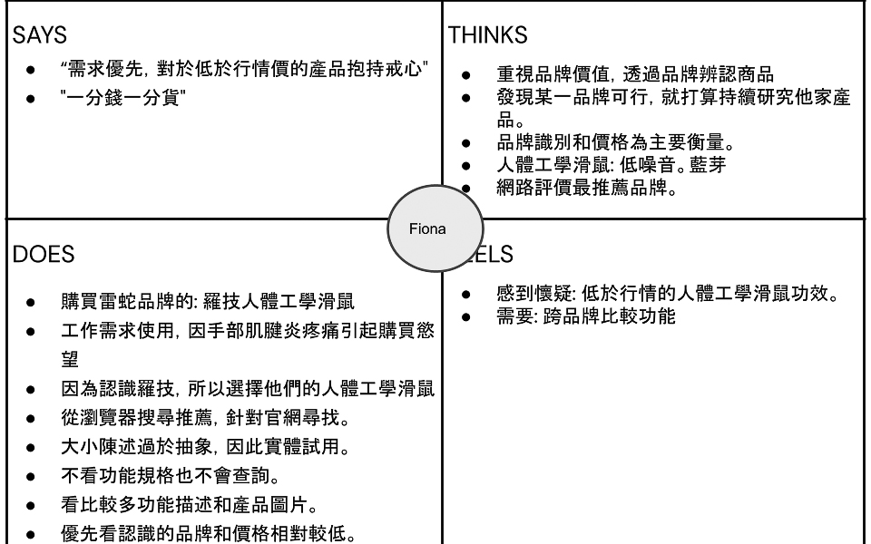
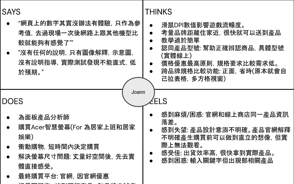
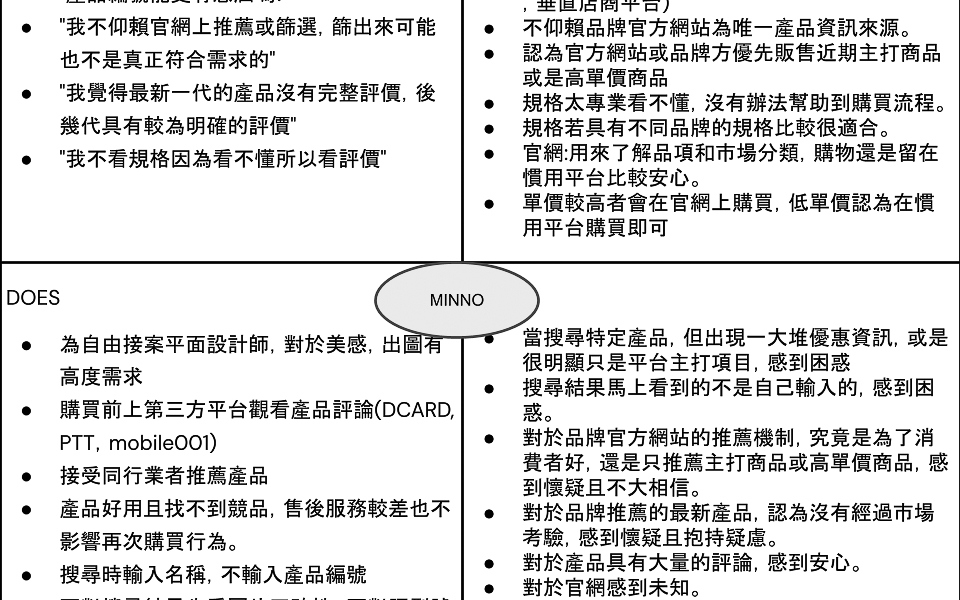
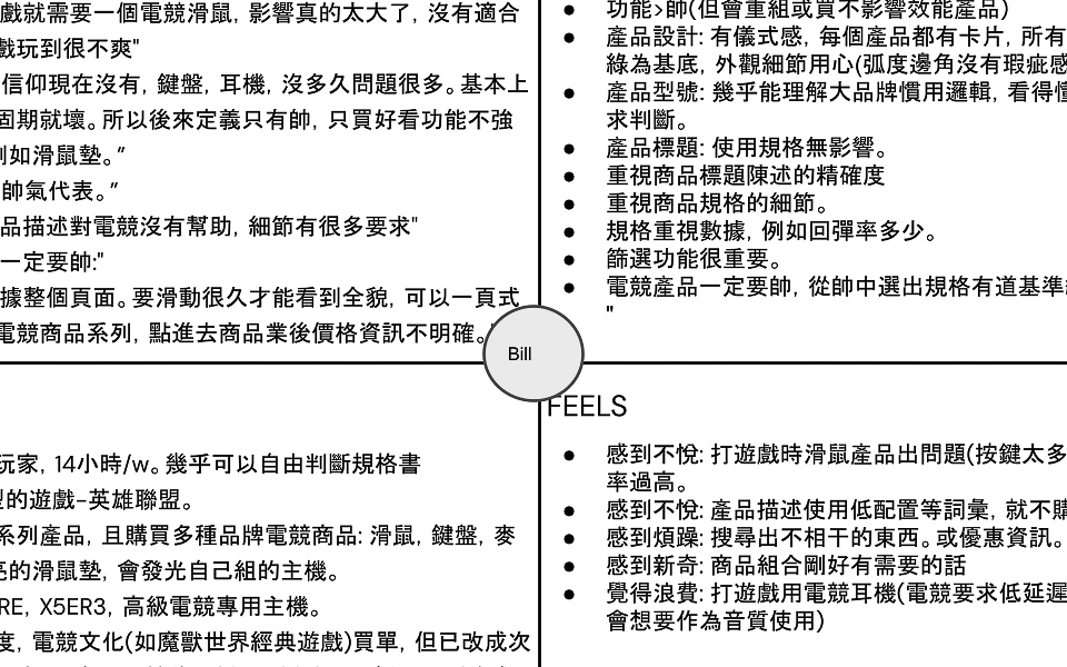
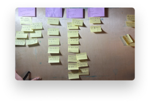
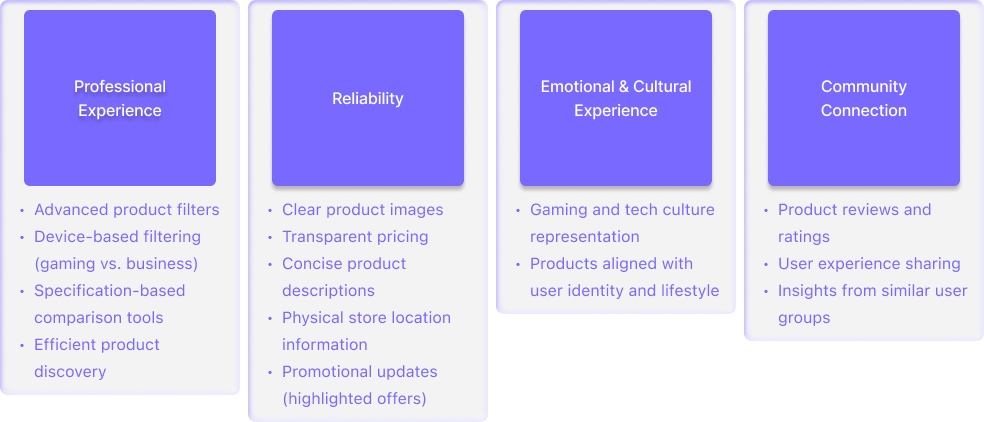
Empathy Map –> Key Pain Points
Through Affinity Mapping, I discovered key pain points:,and develop two peronas.
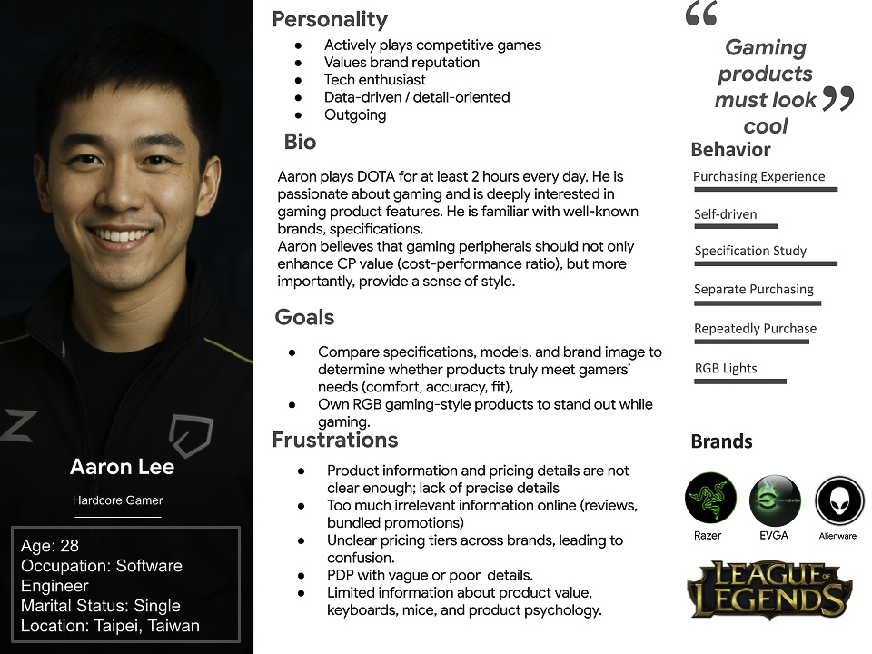
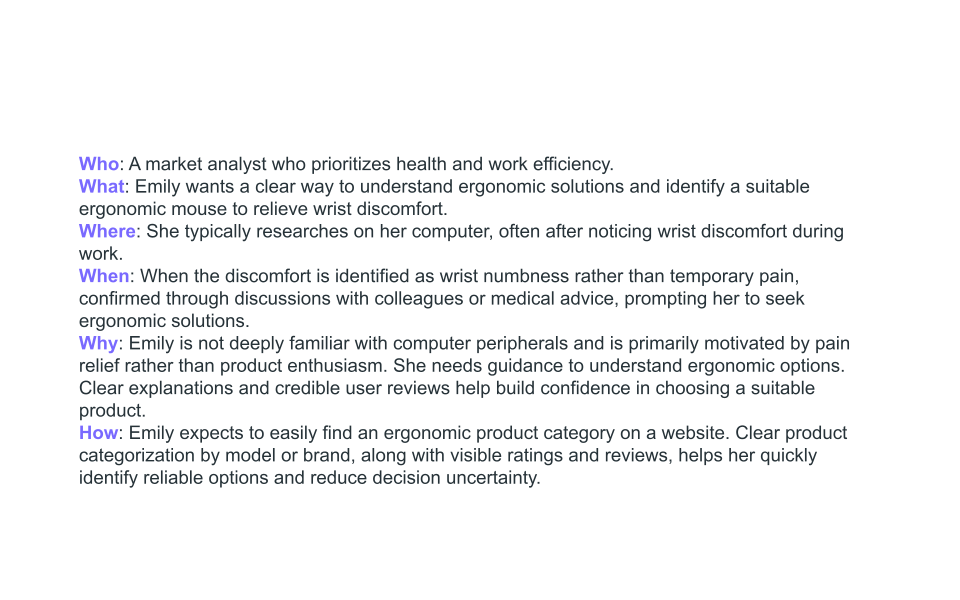
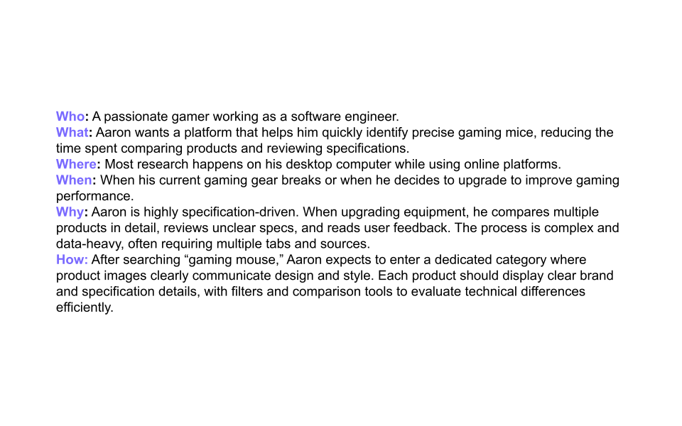
Persona: Aaron Lee
Problem statement
Through Affinity Mapping, I discover key pain points and recognize two types of groups. I developed two groups into two persona.
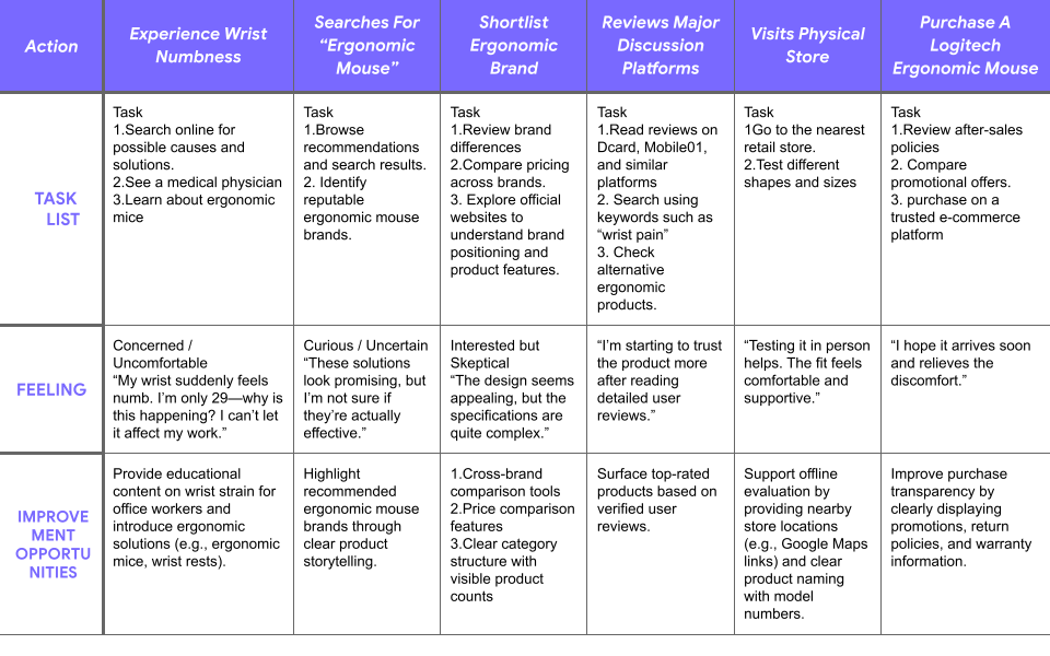
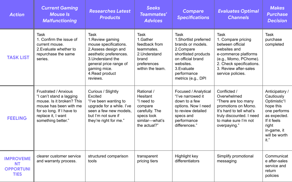
User Journey Map
Aaron Lee and Emily Chen’s Goal
Through user journey mapping, I identified key decision points in the gaming peripheral purchasing process. Both Aaron (competitive gamer) and Emily (ergonomic-focused user) follow a similar workflow: researching product specifications across multiple sources comparing technical attributes between brands evaluating performance before purchase
5 Ws & Problem Statement
By analyzing Aaron and Emily’s Persona and user journey map, I understand that
Aaron Lee is a competitive gamer and advanced buyer
who needs a fast, reliable way to evaluate complex gaming peripheral specifications because he wants every upgrade to deliver a real performance advantage and avoid poor purchase decisions caused by unclear product information.
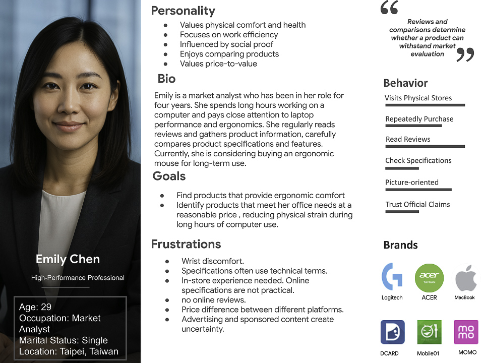
Emily is a productivity-focused office worker
who needs clear guidance when choosing ergonomic peripherals because she wants to reduce wrist strain and maintain work efficiency without spending excessive time understanding complex product specifications.
2. Define
Key Design Challenge
How might we help gamers compare complex product specifications efficiently?
3. Ideate
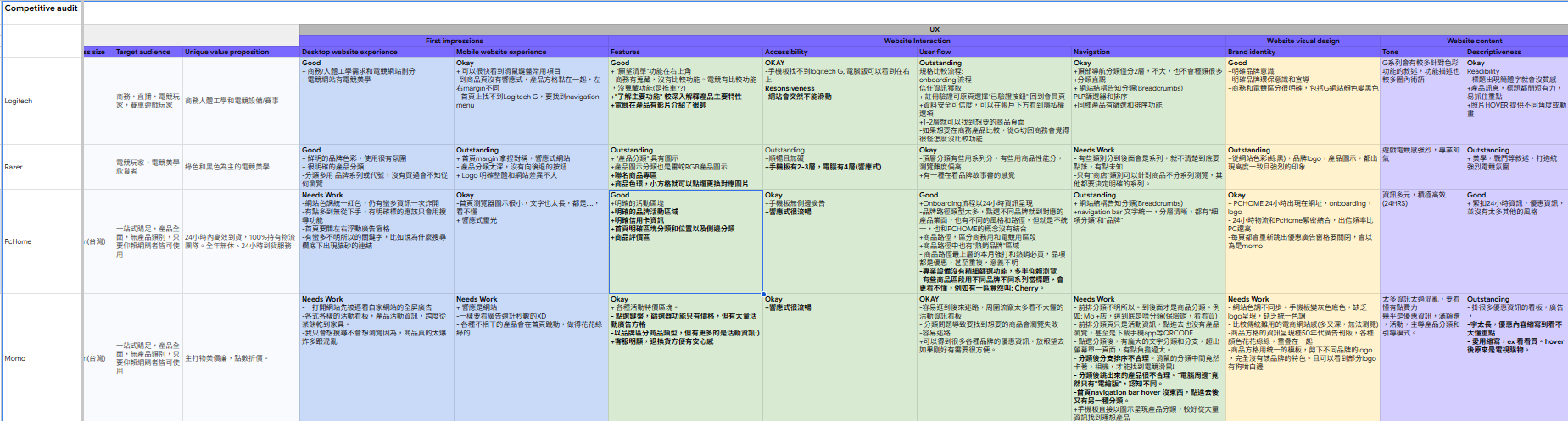
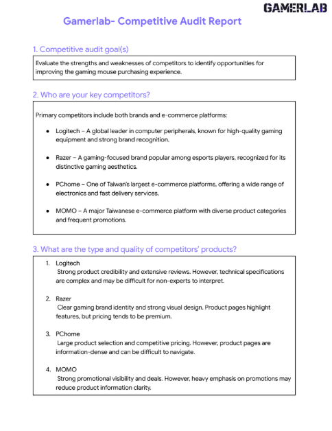
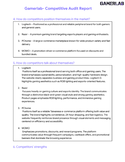
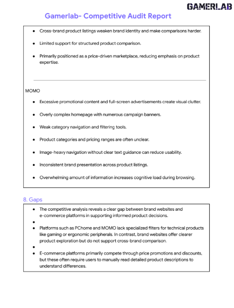
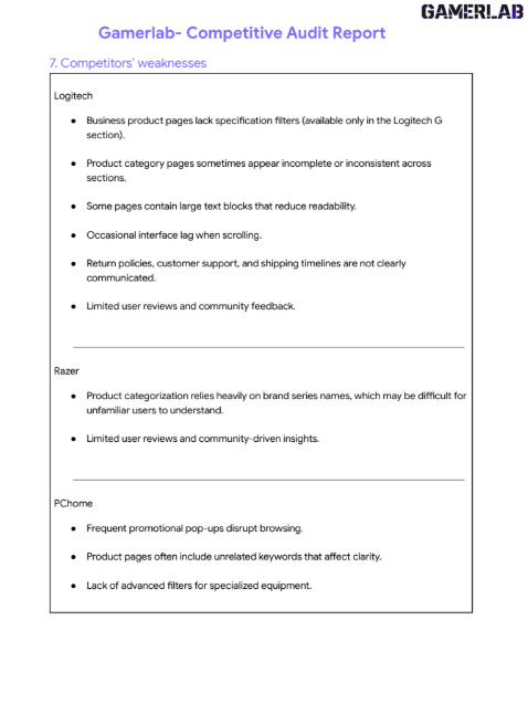
Competitive Audit
According to Jakob’s Law, Users spend most of their time on other sites. At the beginning of Ideate stage, I decide to analyze the competitors on the current market. 2 Direct competitors 2 Indirect competitors After doing the competitive audit report, Gamerlab reduces learning effort.
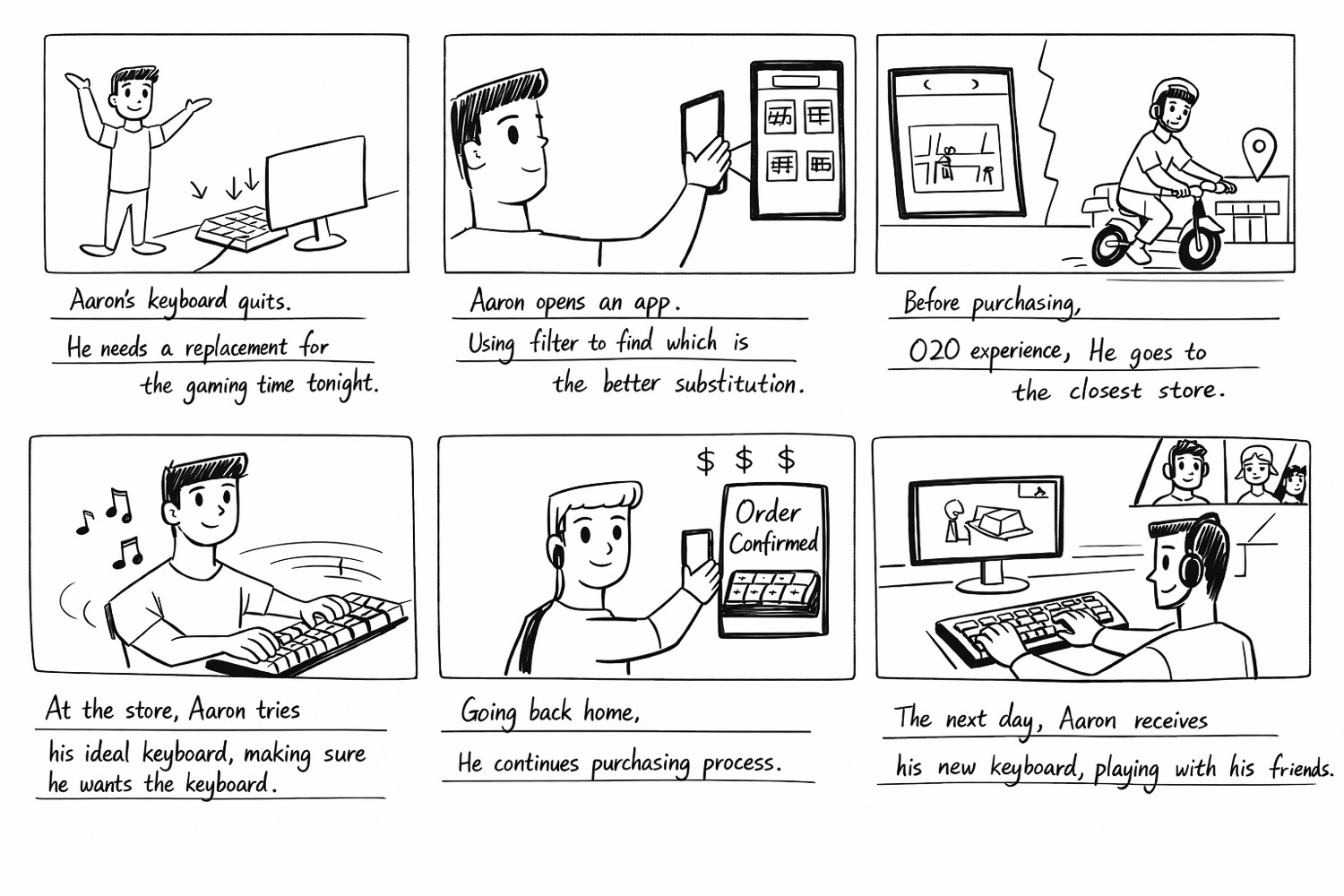
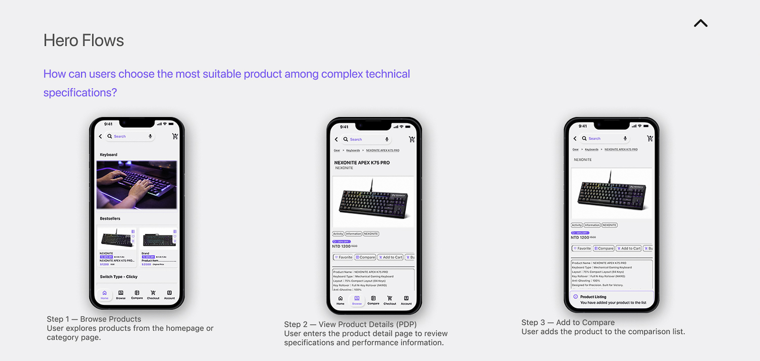
By creating this storyboard, I visualized Aaron’s real-world scenario and identified key moments in his purchasing journey. This helped reveal where design could reduce friction and support faster decision-making. which informed the user flow and design decisions that follow.
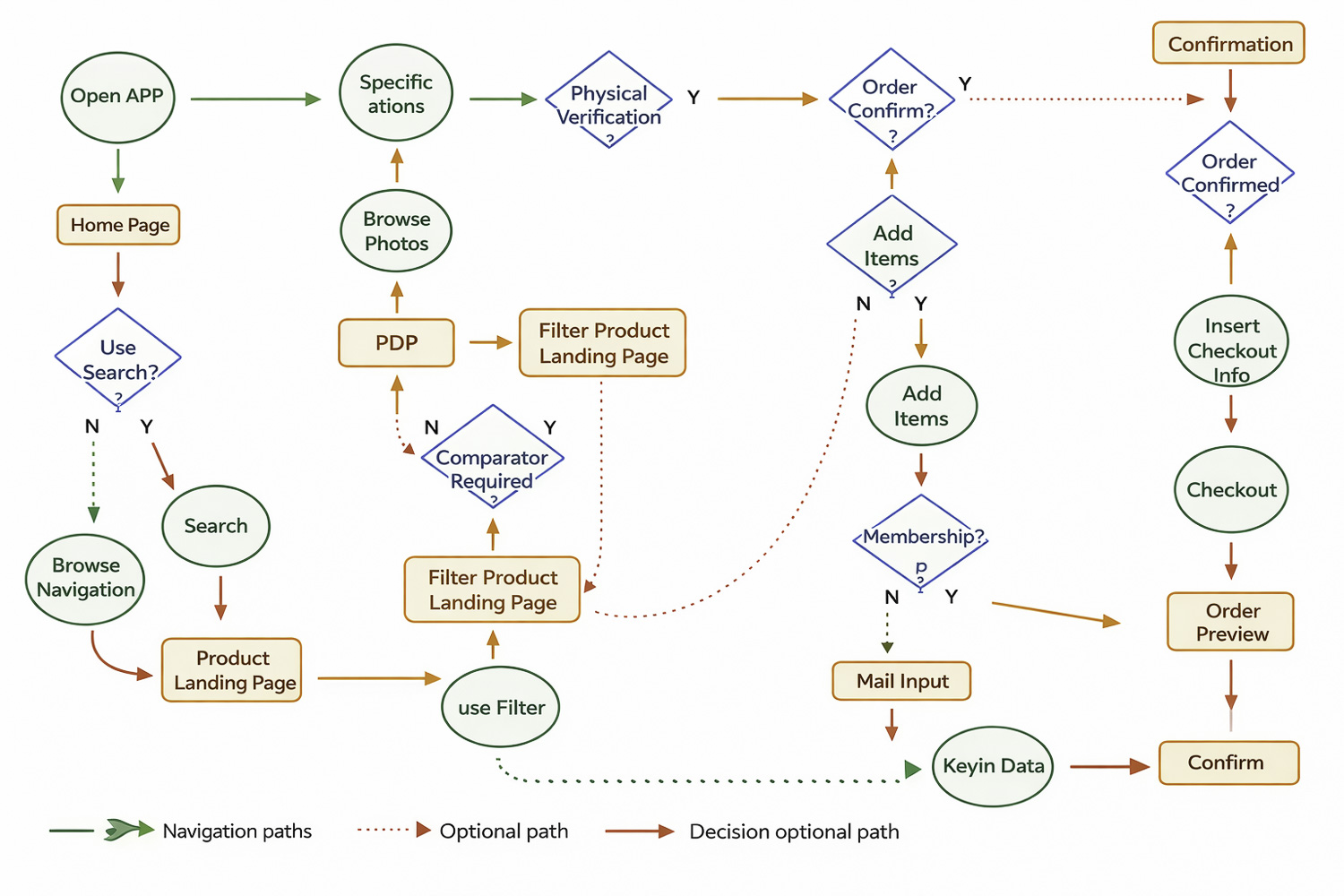
Based on the storyboard insights, I mapped the user flow to understand how Aaron navigates the platform from product discovery to purchase. This helped identify key decision points and opportunities to simplify comparison and checkout.
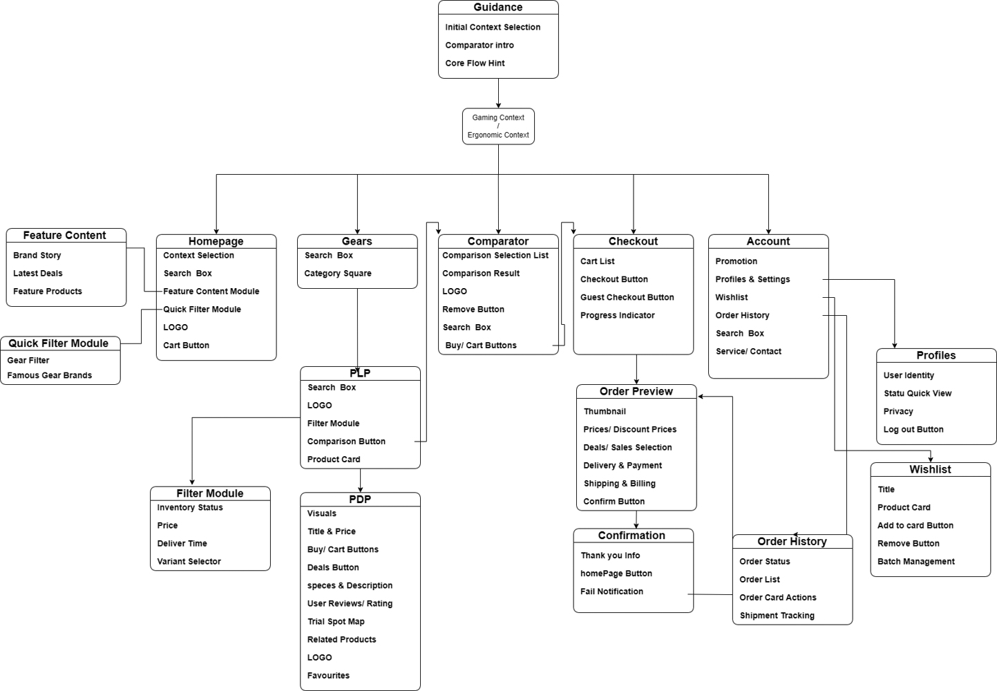
Information Architectue
Based on the user flow, I structured the platform’s information architecture to organize key features and navigation, ensuring users can efficiently move from product discovery to purchase.
4. Wireframe
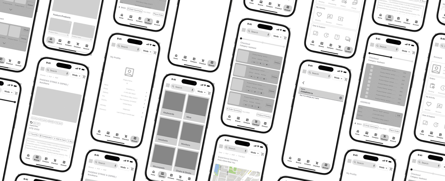
Low-Fidelity Prototype
Based on the information architecture, I created low-fidelity prototypes to visualize the core screens and user interactions. This helped validate the navigation flow and key decision points before moving into high-fidelity design.
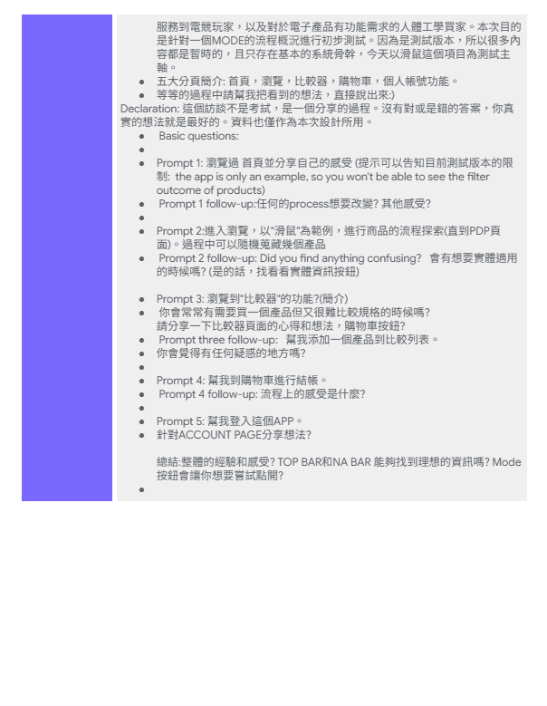
5. Usability Study
Usability Task Objective
To evaluate whether users can efficiently navigate the app and use key features such as product filtering, product comparison, and checkout, and to identify usability issues that affect purchasing decisions.
Method – Moderated Usability Testing
Participants were asked to complete core flows of the app while thinking aloud.
Participants
5 participants who have experience purchasing computer peripherals or gaming equipment online.
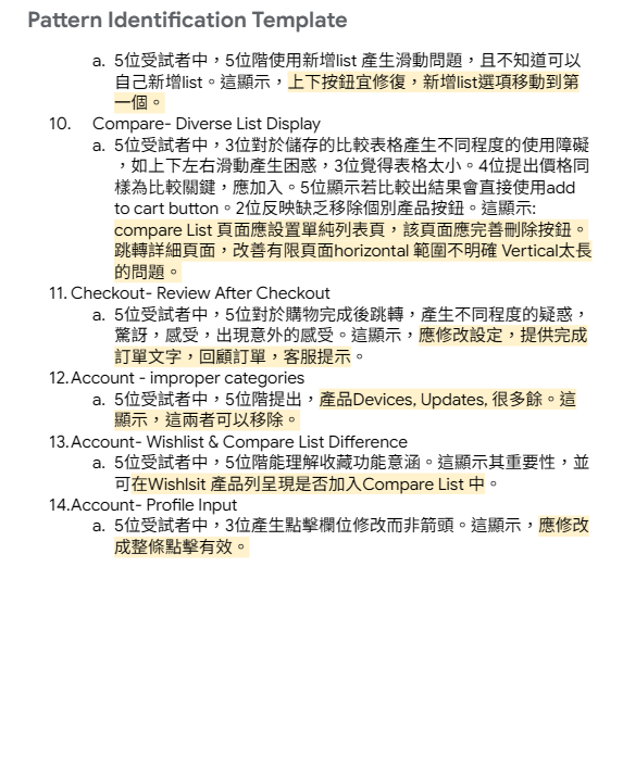
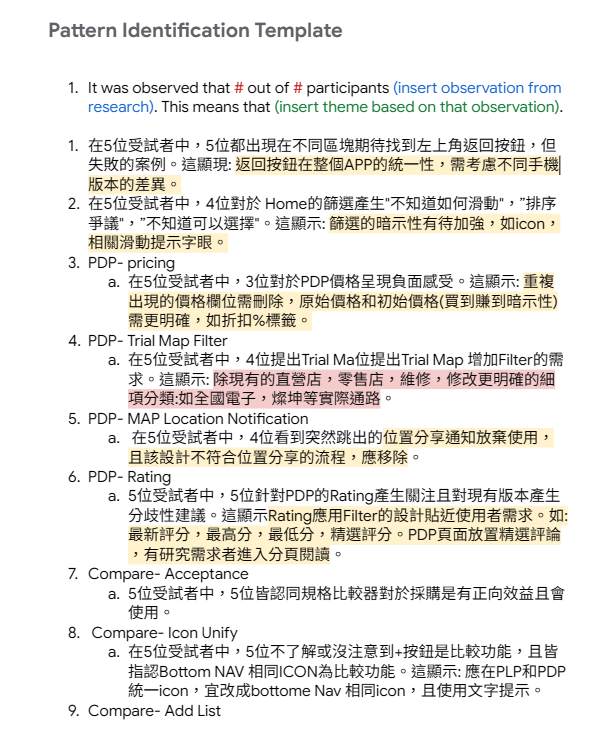
Design Iteration
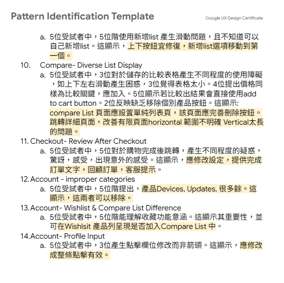
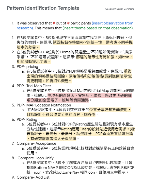
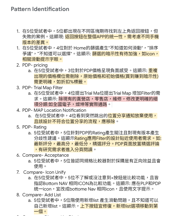
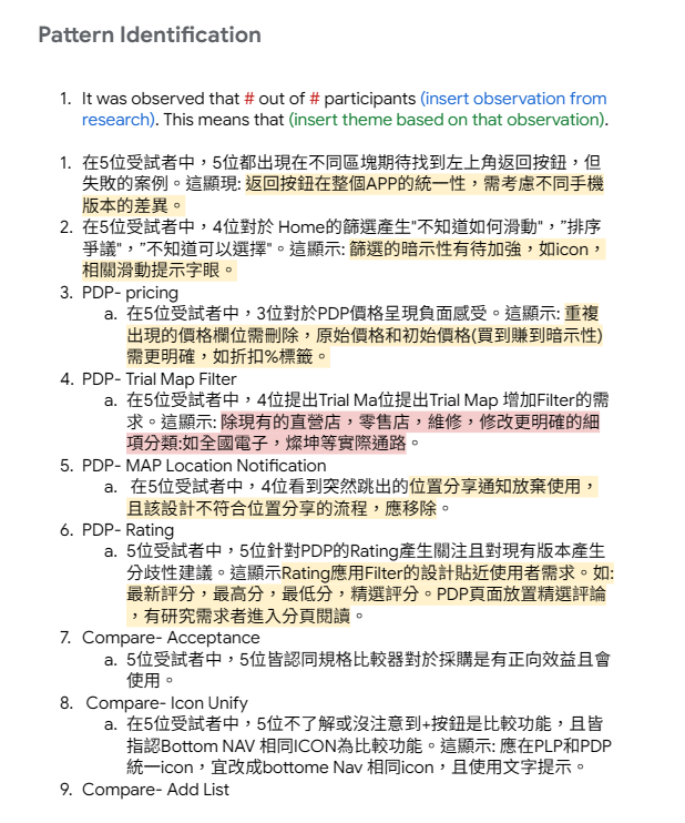
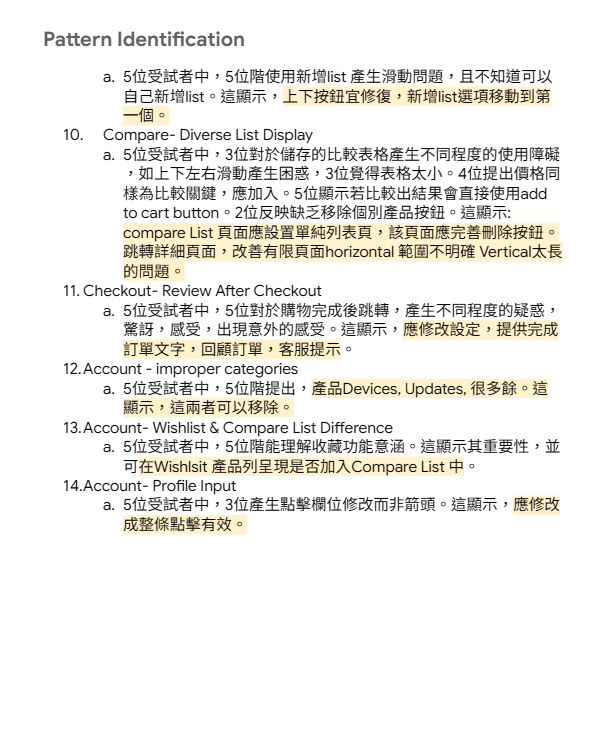
Pattern Identification
Based on these behavioral patterns, I identified several design opportunities: Improve the visibility and accessibility of the comparison feature Strengthen the hierarchy and clarity of filter tools Prioritize visual product information during browsing Structure product specifications to support faster comparison and decision-making
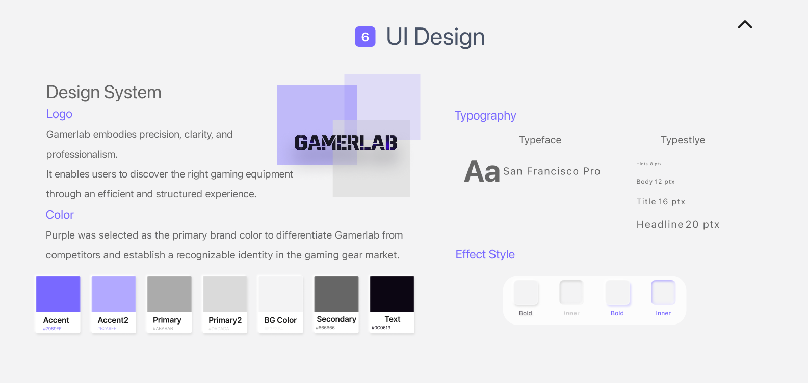
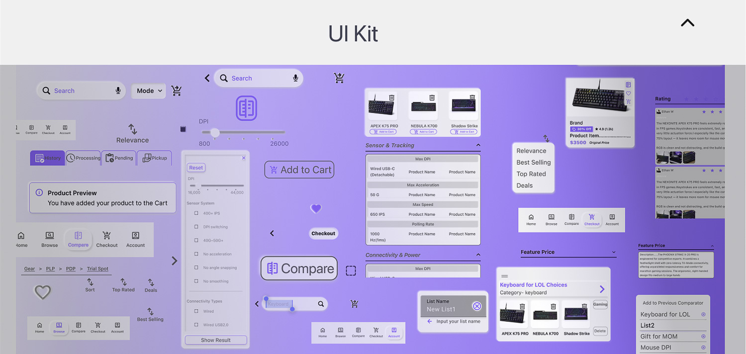
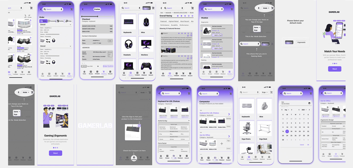
6. UI Design
7. Prototype
“Project Disclaimer: This gaming e-commerce platform is a non-commercial concept design created for UI/UX portfolio purposes. All brand logos and trademarks (e.g., ROG, Razer, Logitech) belong to their respective owners.”
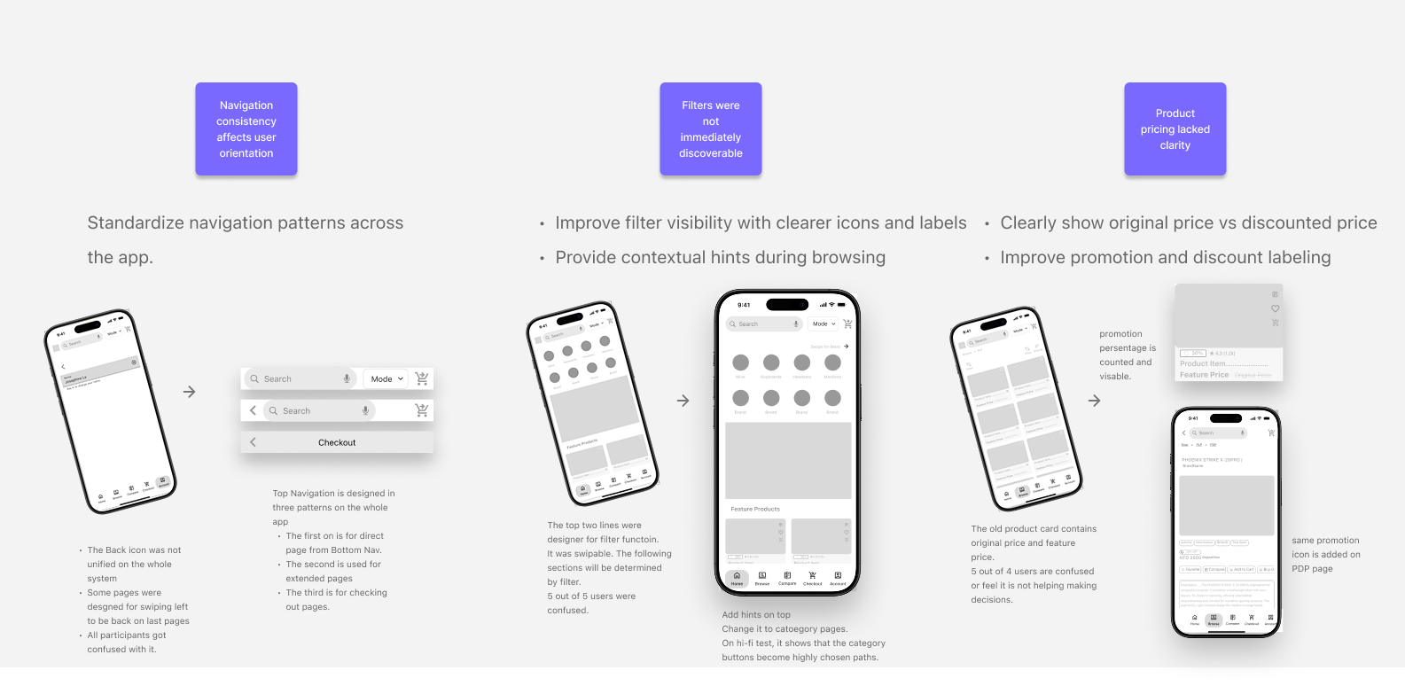
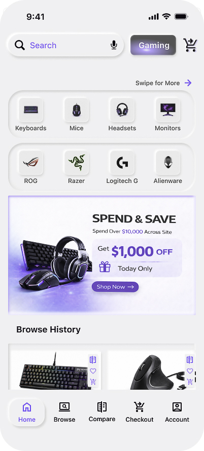
Homepage
is designed to support efficient product discovery by providing quick access to categories, brands, and personalized browsing history.
Design Goal
Surface relevant products based on users’ browsing behavior and usage patterns, enabling quicker and more personalized product discovery.
Category Navigation
The first two rows highlight key product categories, allowing users to quickly navigate to dedicated category pages.
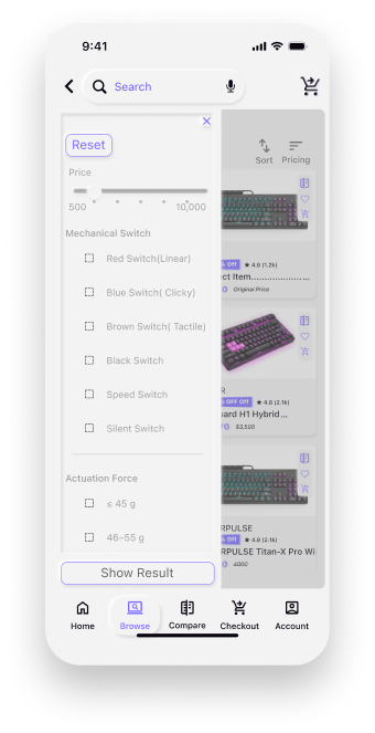
PLP- Filter
The PLP filter provides specification-based filtering tailored for gaming peripherals. Users can refine results using detailed attributes such as price range, switch type, and actuation force, enabling faster and more accurate product discovery.
Design Goal
Enable professional buyers to discover suitable products through detailed specification-based filtering tailored for gaming and ergonomic equipment.
“Project Disclaimer: This gaming e-commerce platform is a non-commercial concept design created for UI/UX portfolio purposes. All brand logos and trademarks (e.g., ROG, Razer, Logitech) belong to their respective owners.”
“Project Disclaimer: This gaming e-commerce platform is a non-commercial concept design created for UI/UX portfolio purposes. All brand logos and trademarks (e.g., ROG, Razer, Logitech) belong to their respective owners.”
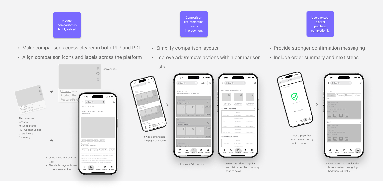
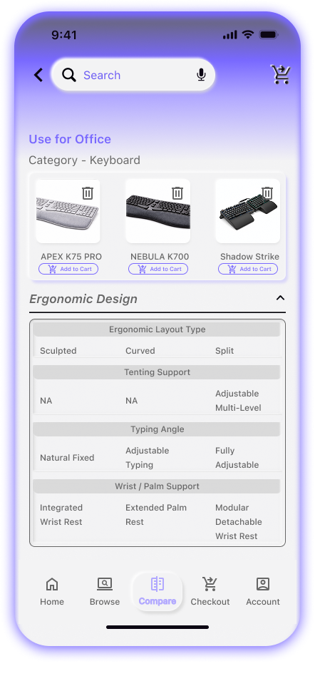
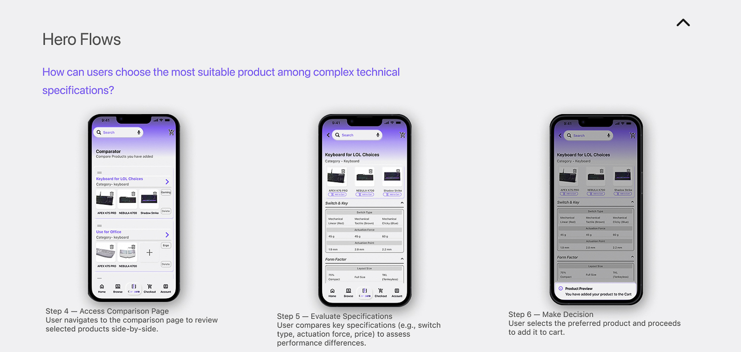
Comparator
The comparator allows users to evaluate detailed product specifications side-by-side, helping professional buyers identify the most suitable equipment. Three products can compare at a list.
Design Goal
Professional buyers are familiar with and sensitive to product specifications. The comparator improves decision-making efficiency by enabling convenient side-by-side comparison of detailed specs, helping them evaluate performance and choose the most suitable product.
8. Usability Task
Behavioral Interaction Visualization
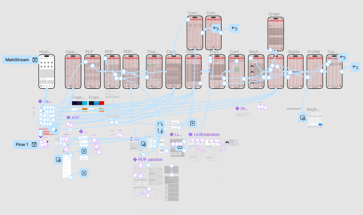
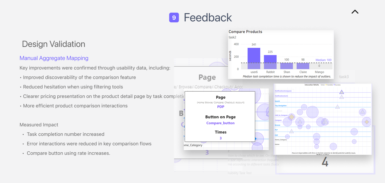
Manual Aggregate Mapping
To analyze hi-fi usability test results, I applied interview data into dynamic visualization dashboard to analyze design insights.Dynamic visualization helps transform raw usability observations into interpretable behavioral patterns. User interactions were manually coded and mapped across key interface elements to identify behavioral patterns.
Why Visualization Matters in UX Analysis
Dynamic visualization helps transform raw usability observations into interpretable behavioral patterns.By visualizing interaction frequency and outcomes, the analysis reveals: Success paths where users follow expected task flows Friction points where users hesitate or repeatedly click Error concentrations indicating unclear UI
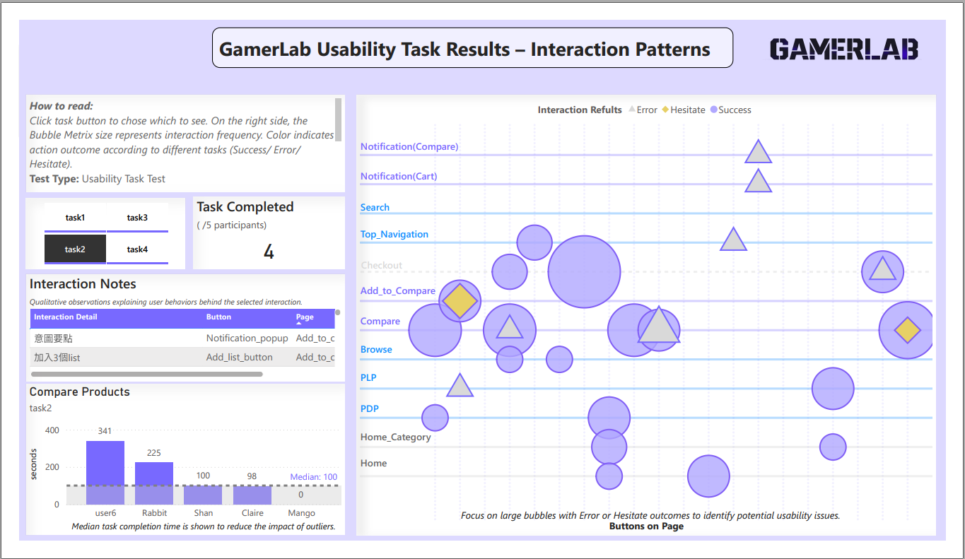
Categorical Bubble Matrix
How to read:
Click task button to chose which to see. On the right side, the Bubble Metrix size represents interaction frequency. Color indicates action outcome according to different tasks (Success/ Error/ Hesitate). Test Type: Usability Task Task Scope: Controlled task flows (Task 1–4) Participants: 5 users · 20 task runs Task Types Covered: Use-case Driven Discovery Product Comparison & Decision Campaign-driven Conversion Gaming vs. Ergo-driven Purchase
9. Lessons learned
Next Iteration Opportunities
Key Insights from Interaction Testing
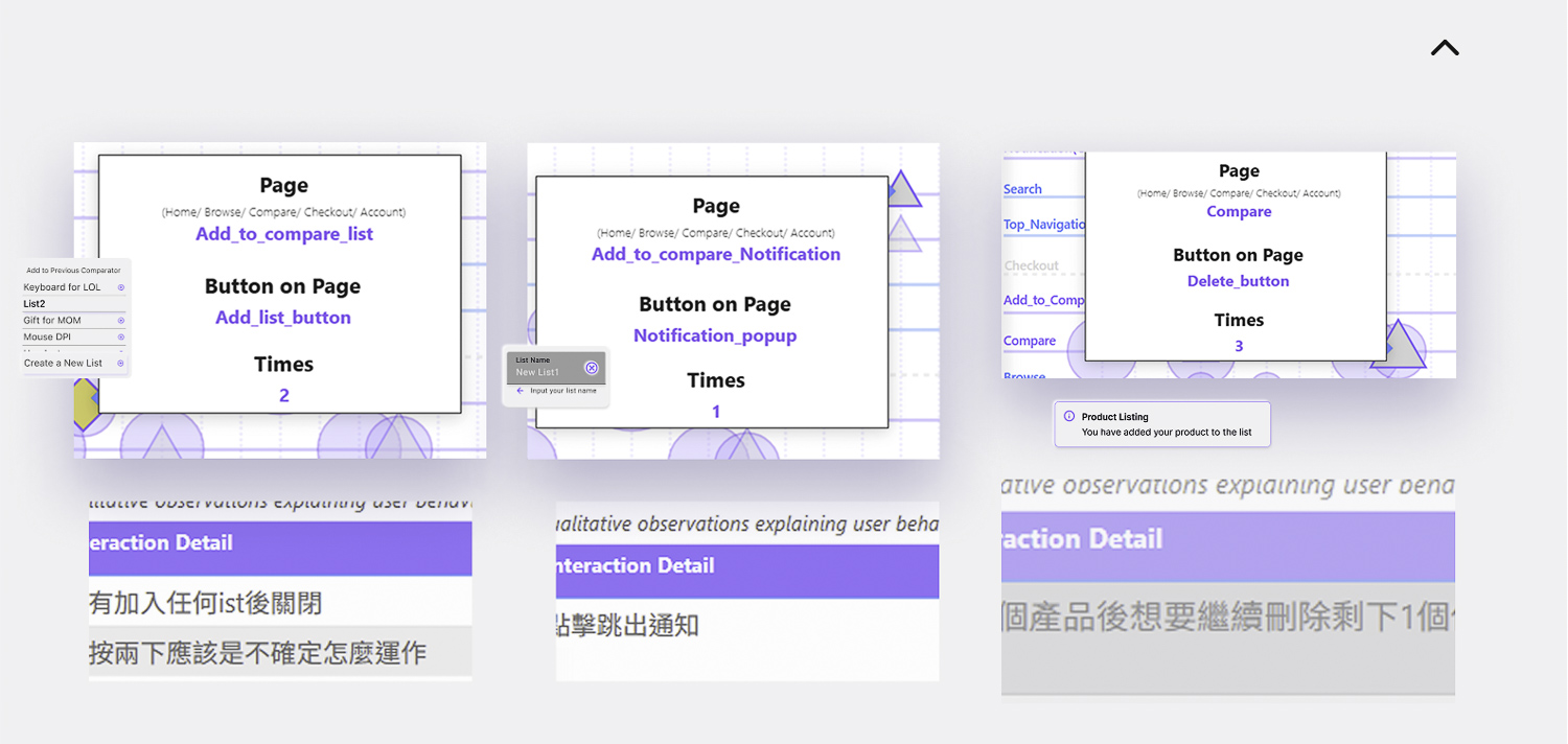
Usability observations revealed several friction points in the comparison workflow. Users often misinterpreted interaction feedback and experienced uncertainty when managing comparison lists.
Design Decisions
These findings informed several design decisions for the next iteration:
Relocate the “Add to List” feedback to avoid accidental clicks. Simplify the flow for creating comparison lists to reduce cognitive load. Improve item removal interactions to provide clearer system feedback.
Product Impact
These refinements focus on improving interaction transparency within the comparison workflow. By making system feedback clearer and simplifying list management, target audienc can evaluate products more efficiently and make purchasing decisions with greater confidence.
Future Iteration Direction
The next iteration will focus on improving interaction clarity in the comparison module and reducing friction in list management. These refinements aim to make the comparison workflow faster and more predictable for users evaluating professional gaming equipment.